

I was thinking.....
I have a new job coming up and they want to use 'blues.'

I don't do much blue.
...so this is me doing some research.

I have always enjoyed blue and green.

It is nature, and I like taking my cues from nature.

How can you go wrong?


Then there is blue & grey.
It is cool and sophisticated.

Is this not gorgeous?

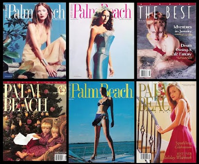
Then there are multi-colored garden floral fabrics
that I can find and be inspired by if need be.

Some do purple and blue.
How about you?

Cobalt Blue.


Soft blues, beiges and tans.

Blue and coral or orange.

The old stand by;
Blue & White.


I did a home in Nantucket that was blue, cream and red,
with a teensy tiny bit of charcoal grey.
Strong blues coupled with strong reds.
It was fabulous.

The color combo was taken from a Jacobean fabric
I found at F.S. Schumacher.

We can always do yellow and blue.
A classique!!!
Which BLUE is you?
I have made my mind up....
it's going to be the blues, and the red tomato bisque.
Renee Finberg 'TELLS ALL' in her BLOG..... Interior Design, Palm Beach, Boca Raton,Ft.Lauderdale,Design Service, Window Treatments, TurnKey Interior Design Service,Paint selection, Floor-Plans,Online Interior Design, Design Center of The Americas, D.C.O.T.A., blue, blue , blue


I could wrap myself in any of those blues but quite fancy blues with gray in it. Moody like me! I have never done a lot with blue either but it's hard not to love it. Just a feel good color. I hope you have a day of rest tomorrow? Perhaps riding a lovely horse and forgetting about clients!
ReplyDeleteHuge hug to you Renee xo xo
Hey Renee
ReplyDeleteI love blue and green.. they have always been my favourites... For some reason lately I have the pink bug [unusual for me]... but I think I'll always be a blue & green girl.. Colours of the sea.
Love each and everyone one of these glorious photos... the blue & red is just delightful too.. See .. too much choice!!
Hope you are having a wonderful holiday weekend.. Take care and rest up!! xxx Julie
very inspiring images... hope you're having a lovely weekend!
ReplyDeleteAbsolutely love every one of those images, but the blue and floral just pulls my eye even though I am fairly sure I would not want it in my home!
ReplyDeleteI think I am very boring and want the blue and white!!!!
I'm not a huge fan of using blue, but pale, (almost pastel blue), with beige is delightful.
ReplyDeleteI did the blue and white decor in a little cottage we owned, with a splash of yellow here and there.
ReplyDeleteI also love navy and cream together.
I don't do much blue either. So this is very inspirational.
ReplyDeleteDear Renee,
ReplyDeleteI have never been a blue girl either but these images are enough to change my mind. I'm with Deb....a bit of blue and the right shade of grey could look stunning. Good luck with your 'blue assignment' and hope you are having a lovely holiday weekend. XXXX
Julienne,
ReplyDeleteyou can do the multi colored garden floral any where.
it does, it works.
and it is so darn happy.
xx
Yeah, the grays/silvers with the blue makes me happy. I love this post with all the beautiful pics, Renee. A nice holiday Monday post.
ReplyDeletexx's
mmmmm.... I love the blue and gray...but think I am a blue and tomato bisque gal...with a splash of yellow... or is is gold...or...
ReplyDeleteRenee,
ReplyDeleteI have done a lot of blue mostly faded denim blue with pale creamy yellows. It's relaxing and comforting for most. Great snaps and as a designer become one with the color and feel it change you for the duration of the project consult your inner artist.
Bette
Ideezine
ReplyDeletei love your comments.
that is exactly what i am doing.
xx
I am sure it will be stunning, Renee! Happy Labor Day! xo
ReplyDeleteI have this very nice client I'm working with from CT. They're blue. (It just took us a while to figure it out) And yellow which we are calling buttercream. Has a nice ring to it I think. And we've mixed it with the whole melange of greens from the vines of nature and soft roses of the gardens and ivory.
ReplyDeleteWhat am I trying to say? Kravet Galerius 1615 - take a look. We didnt use it but its a stepping stone towards success. each little baby step forward. One day at a time.
Happy Labor day bud.
I love the blue and green in the 5th picture! Blue is not my 'go to' color, you have done some great research girl! Beautiful!
ReplyDeleteI hope you have had a little 'me' time.
xoxo
roslyn
ReplyDeletethanks for the comment.
i have been nutty at work.
you know....
the labor day sale, blah blah blah
i will call tomorrow
love ya'
xx
Hi Renee,
ReplyDeleteI came over via your lovely comment and so glad I did.
I don't know how I've missed your lovely blog and am looking forward to more of it!!
I'll be back often!!
Terri
x
I love the greyish blues, light and dark. Reminds me of the sky and the sea after a storm (for some reason).
ReplyDeleteJust discovered your blog. Love it! I don't use much blue either, but your images are inspiring. Which blue would I use? Probably the classic blue and white.
ReplyDeleteI love a light blue with some depth {perwinkle-ish} with a deep camel color. I agree with strong blue and strong reds - I love turquoise + red!
ReplyDelete